
- By Vanshika Choudhary
- June 20, 2025
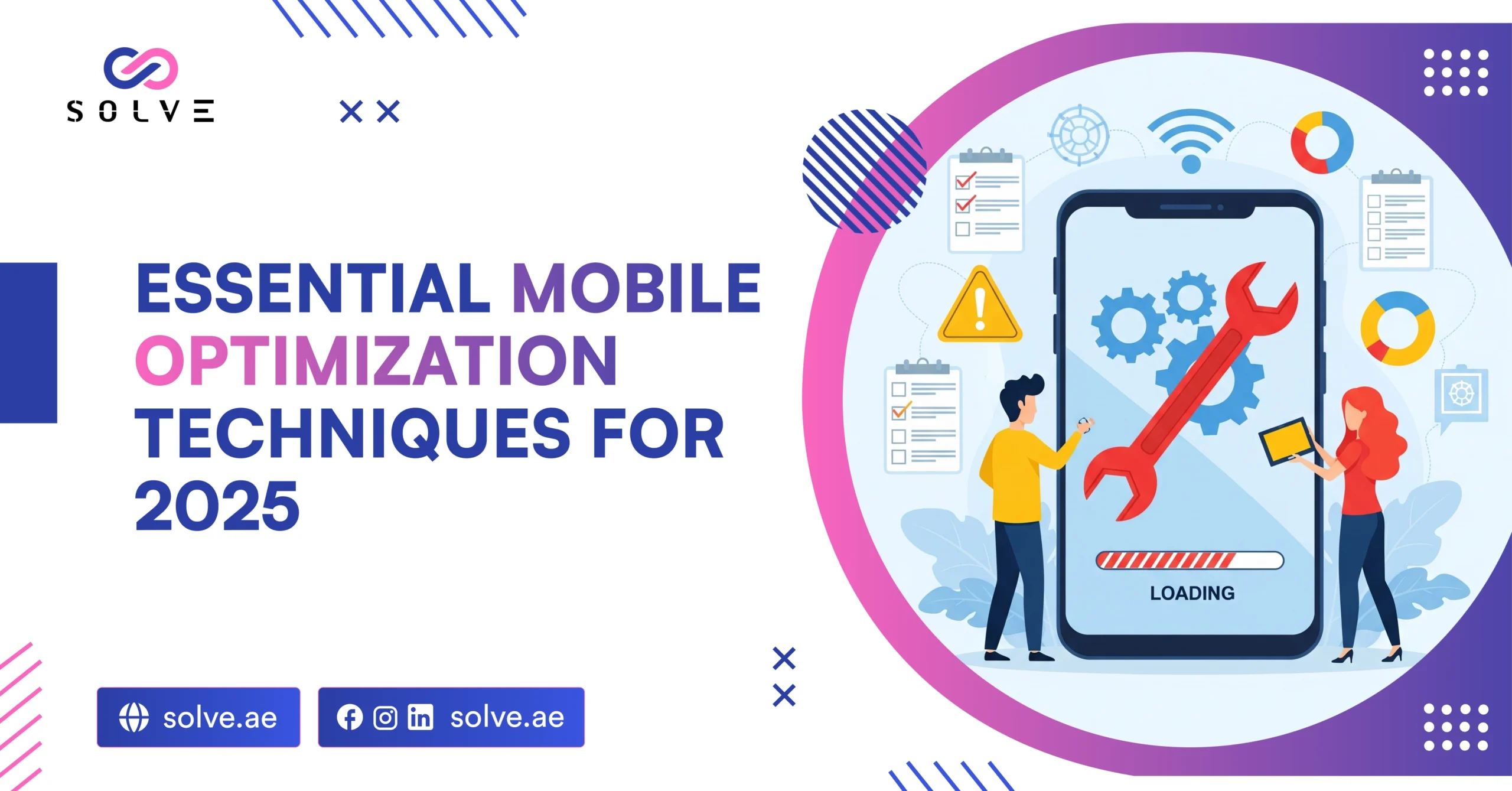
Today, billions of users see mobile devices as the entry to the internet. The ability to optimize for mobile users is therefore of paramount importance in 2025, as the majority of users might expect their experiences on their smartphones or tablets to be seamless, swift, and enjoyable. Going against the grain of Essential Mobile Optimization is a sure way for a company to lose customers, fall behind in search rankings, and completely miss those rare decisions for profit. In this blog, we will look into some of the best tricks available to optimize mobile marketing in 2025; design, speed, user experience, security, and the latest working trends will all be included.
Responsive and Adaptive Designs: A Must for a Mobile-Friendly Website
A responsive site changes the format, images, and content to suit any screen size for a consistent experience. Adaptive design, on the other hand, focuses on mentioning different layouts or features, depending on the device type, to deliver the best user experience.
Test your site on various devices from time to time to snag any display or functionality issues before they hit your visitors. When you go for these design principles, your site looks professional and works well for every end-user, no matter how he accesses it.
Loading Speed and Performance Optimization
Speed is a big consideration for a mobile user who wants websites to open within a few seconds. A slow-loading site frustrates visitors and increases bounce rates, directly killing the reputation and revenue of the business. Image optimization, minimizing CSS and JS, and leveraging browser caching are techniques that should never be omitted if site speed is to be worked on. Along with PageSpeed Insights, Google will also make recommendations that, if implemented, should dramatically increase performance.
Mobile-Friendly Navigation and User Experience
Mobile navigation should be simple and intuitive due to users interacting with sites on smaller screens and often with one hand. Large buttons that are easy to tap and minimalistic menus allow the visitors to immediately and easily access items or information.
Short and simple forms ease the user’s completion of an action without any sort of frustration or error. Avoid disruptive pop-ups and use uncluttered layouts to guarantee smooth and pleasant browsing.
Clear calls to action then bring users towards the desired goal, actually enhancing user interaction and conversion.
Optimize for Voice and Local Search
With the rise of voice search, people are increasingly using it for quick answers or local information on the go. The better optimized your content is for conversational keywords and natural language, the better your chances of standing out in voice search results. To stand tall locally, one must have up-to-date and accurate location details as well as an active Google My Business profile. Schema markup will then assist search engines to comprehend your content diversely for better voice and local search ranking. All these will help you in reaching mobile users.
Always Consider Security and Accessibility
The HTTPS site is secure from user data leakage; it builds trust for mobile users, especially those on public Wi-Fi networks. Accessibility means the site should be usable by everyone, including people with disabilities.
Readable fonts, proper color contrasts, and proper alt text for images assist in making your content usable for all visitors. Updates and patches will update your site against security issues while keeping it compatible with the most recent devices and browsers. When prioritizing security and accessibility, you increase your audience by showing interest in user safety.
Optimize Content for Mobile Consumption
Mobile users normally skim through content; hence, the most important thing is to make the content short and easy to swallow. Make use of short paragraphs, bullet points, and good heading structures to break down the text and lead the way for the site users. The top section of the page should contain the most important information so that users can find it quickly. Images and videos should be optimized for mobile screens so that they do not make it slower to load or create display issues. Good content structure and mobile friendliness go hand in hand.
Leverage Progressive Web Apps and Mobile Features
PWAs can be used for their speed, reliability, and engaging experiences on mobile devices across the whole spectrum of website features and native app features. They are able to go offline, they can send push notifications, and with a minimum load time, they can function well, even with a feeble internet connection.
So, ideally, this is what your mobile-first customers would want. Native functionalities like geolocation, camera access, or even one-tap payments can add further enhancement to user convenience and satisfaction. check out our latest blog post on What Makes a Mobile App User-Friendly?
Doing these would help the business stand out and cater to the very high expectations of today’s mobile users.
Analyze User Behavior and Improve Continuously
Analytics tools shed light on user behavior by evaluating engagement metrics on the site: which pages deliver, where the visitors exit, and what actions they actually carry out. Obtaining customer feedback through surveys or usability testing will help to identify pain points and areas with scope for improvement. One can set up A/B tests and experiment with designs, features, or content, each having the potential to yield the best resonance among users. If one sets up continuous improvement, the site thereby stays user-friendly and competitive and negates the drop in user expectations over time.
Get Mobile-First Indexing Strategies Implemented
With search engines rightly prioritizing mobile versions of websites for indexing and ranking, it is fairly evident that the adoption of a mobile-first strategy is much needed.
This means your site has been designed and developed with mobile users as the primary target audience and so all content and images thereon, not to mention features, are well-optimized for smaller display screens.
Mobile-first indexing demands that you maintain parity of content across desktop and mobile so that you do not find your search visibility diluted.
Enhance Mobile Checkout and E-Commerce Experience
Before a business can have maximum conversions, it has to offer the best mobile checkout experience. Simplifying the flow with fewer steps and an option for guest checkout is required to minimize cart abandonment rates. Secure mobile forms of payment like digital wallets or one-tap payments, create a faster checkout process. A smooth and reliable checkout on the mobile device thus leaves customers glad to make the buy and in fact, willing to return to buy more.
Double Up with Accelerated Mobile Pages (AMP)
The intent of Accelerated Mobile Pages (AMP) is to make web pages appear nearly instantaneous on mobiles. Amp goes with the somewhat stripped-down version of HTML and heavy restrictions on any kind of cumbersome scripts that degrade performance.
By introducing AMP, you increase the visibility of your site in search engines, as google highly prefers placements for top AMP pages. AMP is suited specifically for news sites and blogs and all other content-heavy sites, where speed is everything.
Encourage Engagement with Push Notifications
Push notifications remain an effective way to connect with mobile users and entice them to return to the website or app. The push can be for an update or time-based promotion or just reminding the user about something. Personalizing the notifications based on user behavior or preference increases the chance of the users interacting with them. Ultimately, the effective use of push notifications increases engagement, retention, and sales.
Add Social Media Sharing and Login Options
Social networking is now the major way that users discover and interact with content on mobiles. Provide visitors with user-friendly buttons to share content socially and allow them to sell their marketing ideas quickly. Social logins simplify registration and signing in, lowering barriers to finding out some knowledge about user preferences and behaviors for integrating social networking.
Mobile SEO and Algorithm Updates
Mobile SEO is an ongoing activity, so it demands a constant eye on changing algorithms and updates in different search engines. Up to date with the best practices will ensure that your website is being displayed and competing in mobile search.
Monitor your rankings, your traffic, and the behaviors of your users on an ongoing basis so that you might spot issues or potential areas for improvement.
Structured data, meta tags well optimized, and a mobile site—one with the latest version of the site—will account for much of SEO. Proactive strategies in mobile SEO help businesses to always stand at the forefront amidst rapid digital changes.
Conclusion
Essenjtial Mobile optimization is no longer a sphere of fancy—it is indispensably necessary for any business intending to succeed beyond 2025. Ensuring a stellar mobile experience means ensuring the mobile interface scores high on responsive design, speed & UX, voice and local search, security, content, PWAs, and the latest tech. Analyze and iterate with time to stay relevant and effective with ever-evolving user expectations and technology.
Discover how our expert mobile optimization can help to develop your business in the mobile-first world of 2025! Contact us and let’s create together a website that satisfies consumers and brings success to your business.